BLOG
Fine Art Print
Broken-Down Truck
By Kaden Stephens
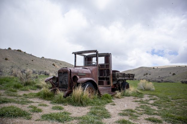
BEFORE
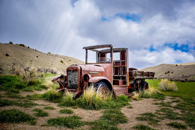
After
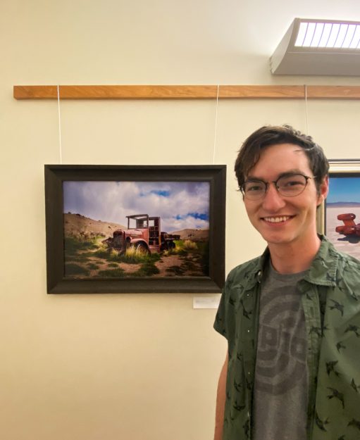
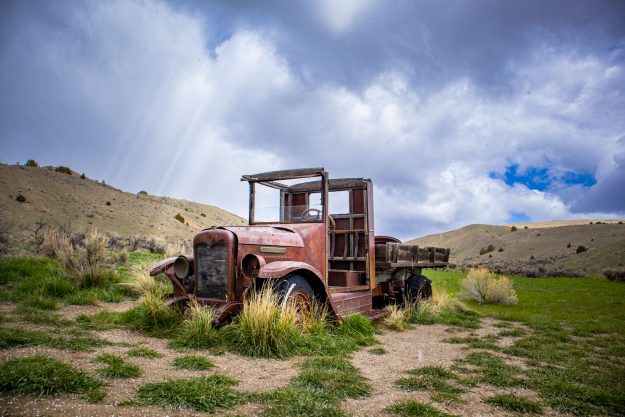
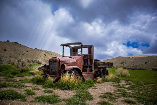
This week, I was able to have one of my fine art pieces printed. The piece I worked with was the broken-down truck from Bannack ghost town. To get the picture ready, I took the image into Camera Raw and Adobe Photoshop. I started off by bracketing three separate shots to get more of the details to stand out. After I merged all the bracketed images, I went into Camera Raw to enhance the lighting and colors. I added some sun rays to the front of the truck to make the shot look more interesting. After I was comfortable with the edits I made, I took the image into Photoshop to prepare it for printing. To make the details more prominent on the print, I added a sharpening layer. Once I got all the details to a level that I was happy with, I sent it in to be printed. It just arrived this past week, and I’m super happy with how it all turned out.
FIND ME ON SOCIAL MEDIA

kaden’s content
Phone Photography
This week, for my Digital Imaging class, I tested out taking some pictures with my smartphone (iPhone X) instead of my DSLR. I went to the upper fields of BYU-I with some of my friends and was able to capture a few interesting shots. For this photoshoot, I used several techniques to capture images with unique points of view, shallow depth, and flat lay and panorama styles. Unlike my usual process, I did all the photo editing on my phone instead of on my laptop.
SHALLOW DEPTH
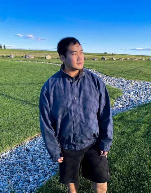
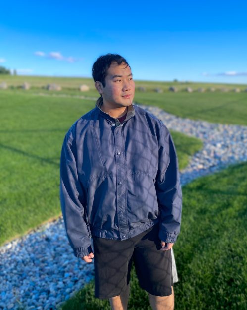
For my shallow-depth images, I used the portrait mode on my smartphone’s camera to add a blurred background to my image. For this photo, I took a picture of my friend standing in front of a field. In the first image, I applied no effect and left the background unedited. In the second photo, I changed my camera setting to portrait and my phone automatically added a background blur to the image.
Deep depth
Shallow depth
Point of view
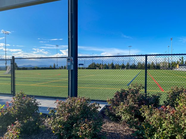
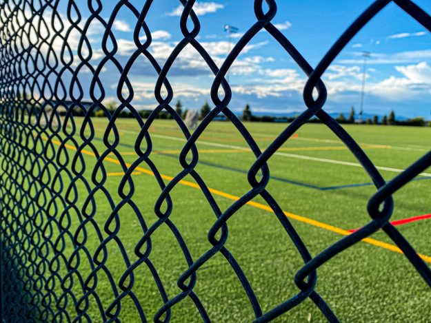
The objective of my point-of-view images was to take a normal-looking scene and alter the perspective in a way to make it look more interesting. For the following images, I took a picture of the BYU-Idaho upper fields. For the first image, I took an image of the field with the fence in the center of the frame. For the second image, I changed my position to angle the fence in a more interesting way to improve the composition. To do this, I stood closer to the fence and angled my lens to create leading lines and to bring the patterns of the fence more into view.
Before
After
Flat Lay
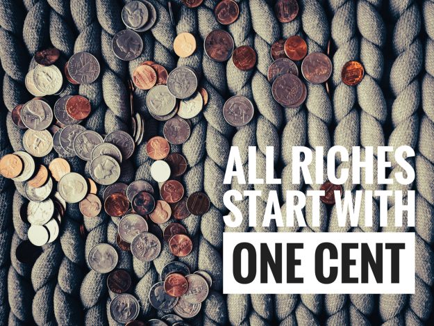
For my flat lay image, I set up some props in my room. I used my knitted quilt to add an interesting pattern to the background where I laid out the remaining materials. The materials I used were some spare change I had collecting in a jar on my shelf. After I got a few shots that I liked, I used an app called Snapseed to add some of the edits and the text. It was exciting learning a new photo editing software that I could simply use on my phone.
Spare Change
Panorama
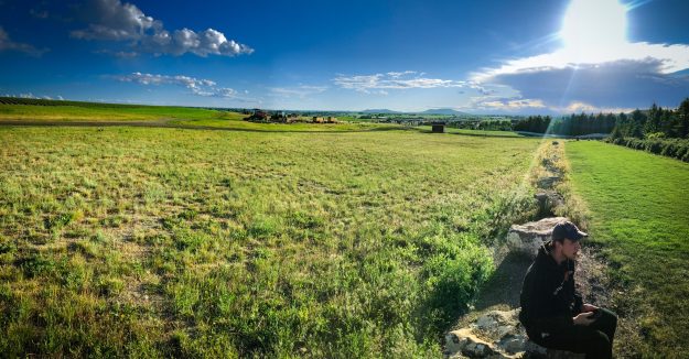
For my final image of a panorama, I wanted to go to a location that had a wide-open area. There was a great spot behind the upper fields with a big open space to capture some wide angles. I used the panorama setting on my phone’s camera to capture a long stretch of the entire area. While I was capturing my shot, one of my friends sat down on one of the rocks in the frame. This added to the vastness of the area and helped build the scene.
Sitting in the fields
FIND ME ON SOCIAL MEDIA

kaden’s content
Photo Contest
Gurushots Entries
By Kaden Stephens
With all of the pictures I have been taking over the past several weeks, I decided to submit a few to some contests. Here are some of the photos that I submitted:
Black & White Portraits
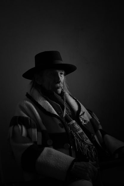
ALONE IN THE DARK
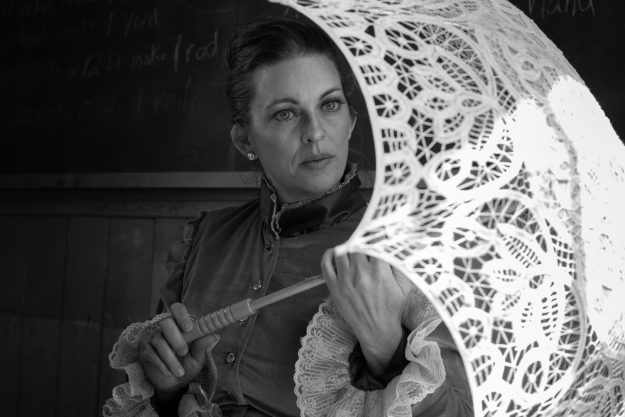
UMBRELLA
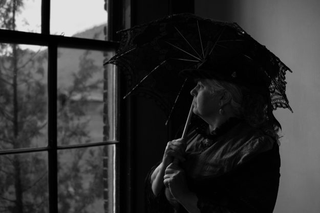
OUT THE WINDOW
SPURS
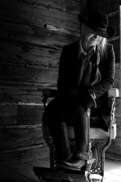
This contest was a four-photo challenge. The contest requirements were black and white portraits that were each unique from the other. To prepare for my submission, I took four of my favorite portraits from Bannack and edited them to be black and white. The entry was simple, its main focus was the images, and required no written content. I submitted them as a group and they immediately made their way out to viewers.
I selected this specific contest because its requirements best matched the photos that I had taken. I was super happy with my portrait work and was excited to submit them to an official competition. Another thing about this website is that it was super easy to set up and use. My images were uploaded into the competition in just a few seconds and immediately began getting likes and views.
These contest entries were submitted June 10, 2022
FIND ME ON SOCIAL MEDIA

kaden’s content
Top 5
By Kaden Stephens
This week, I would like to look back at some of my favorite pictures from the past several weeks. I feel like I have grown so much from this short time that I have started learning about photography. It has been a great time of figuring out settings, balance, composition, creativity, and all the other little things that tie into using a camera. Here are five of the pieces that I am most proud of and that I think show how I have improved.
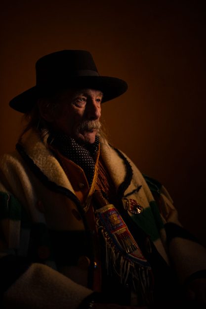
ALONE IN THE DARK
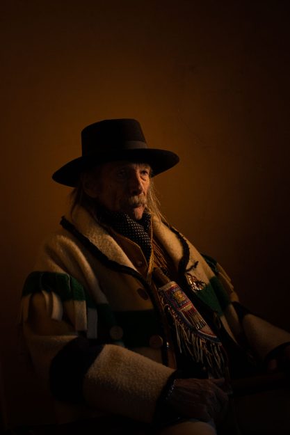
This first image really stood out to me when I first captured it. The lighting looked great and I love how the shadows worked in the composition. They brought in a certain emotion that I found to be very powerful. I put this image in my top five because it carried a strong emotion with it. I felt that his face created a story that could be open to personal interpretation.
CANDLELIGHT
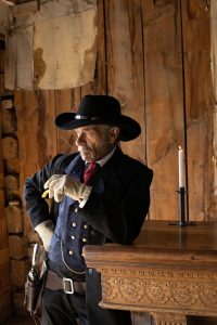
This next image also stood out because of the composition. I like how the light came in from the left, illuminating the actor’s face. I also liked how the candle sat deeper in the shadows behind the actor rather than more in the light. I have learned from all my experiences so far to balance the shadows as much as you do the highlights. This adds a more profound feeling to the images and makes them more noticeable. I chose this image because, just like the first one, there is a strong emotion that leaves more room for thought.
RUNNING COLORS
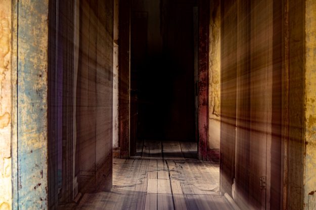
This next image comes from my creative series. To get the effect, I used a slow shutter speed while I slowly zoomed in my lens. This gave the image abstract leading lines going directly into the darkness. I chose this image for my top five because it showed interesting colors and textures while also being open to interpretation. The blurred lines lead the eye directly into the darkness, giving the viewer some sort of emotional response. When I first began using my camera, I was unsuccessful with using this type of effect in my photography. As I learned more, I was proud that I was able to figure it out and create such an interesting image.
MISSING FRIEND
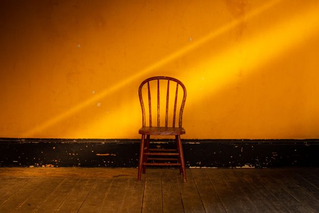
This image is one that really surprised me after I edited it. Looking at the original image, it just looked plain and uninteresting. I chose this image because it shows how much I have grown in my photo editing. I was super happy with how I was able to take an image that I originally didn’t like and make it into one of my favorite images. I feel like the simple composition creates an interesting piece that could evoke a strong emotional response.
BROKE DOWN
This fifth and final image really stood out because of the amount of detail I was able to capture. For this image, I used bracketing to capture all of the highlights and shadows that could bring out all of the details of the shot. I chose this image for my top five because it honestly shocked me with how much detail it contained. I had just learned how to use bracketing that day, and I am super happy that I was able to understand it enough to capture an amazing shot like this.
Overall, I am super happy with how much I have grown over the past several weeks. At the beginning of this experience, I didn’t even know how to turn on a camera let alone take a great picture. I am glad that I have reached a point where I have found confidence in my shots and can trust myself in the creative decisions that I make. I find these five images to be a great representation of my growth. I love that my photos can tell a story and evoke emotion in people who see them. The friends and family I share these images with are continually shocked just as much as I am by how they turn out. I am so grateful for my instructor and the many other examples that have helped me improve. I still look at some of these images and can’t believe that I am the one that took them.
FIND ME ON SOCIAL MEDIA

kaden’s content
Macro Photography
By Kaden Stephens
This week, I am posting some of the macro images I was able to shoot. I haven’t had any experience with this type of photography before, but I thought that it was pretty fun to try out. The biggest trick was learning to balance the lighting to get all of the miniature details to pop.
WATER DROPLETS
FEATHER
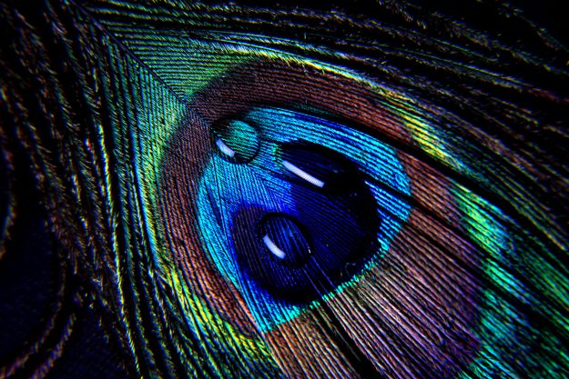
This first image is a closeup I was able to capture of a peacock feather. To get the lighting to work, I had to set up a continuous light right above the feather. It was little awkward positioning myself around the light, but I was able to capture this image where all the colors stood out really well. Through editing, I was able to enhance the colors and contrasts.
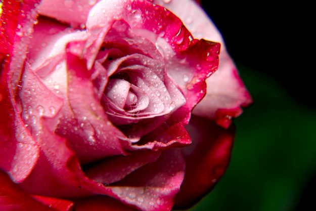
FULL BLOOM
This next photograph was of a pink rose that was lightly covered in water droplets. The color of the flower was beautiful, so I did all that I could to capture the vibrant pinks. Again, I captured this image with an indoor studio continuous light. As I went into editing, I slightly darkened some of the shadows and deepened the colors around the edges of the petals.
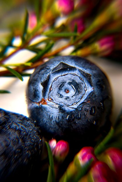
BLUEBERRY
This next image is a closeup of a blueberry surrounded by some pink flower buds. To get the blueberry as clear as I could, I had to take several images until I could finally get a clear shot. In editing, I darkened the shadows and raised the saturation. I also lightened the center of the blueberry to create a stronger focal point.
NO WATER DROPLETS
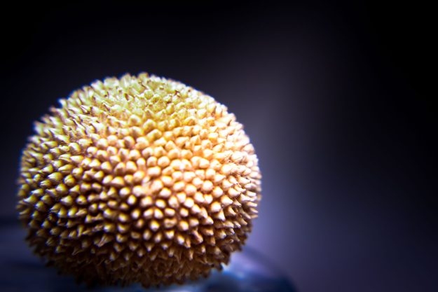
SPIKEY
I found this interesting ball that was covered in spikes along its surface. I don’t really know what it is, but it made an interesting subject in this next image. In editing, I darkened the background to create a higher contrast for the subject.
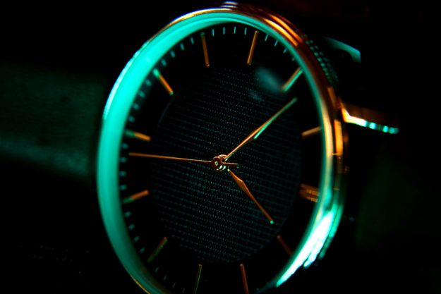
COUNT DOWN
This next image was of a watch that was set up in some pretty interesting lighting. I prepared to capture this image by getting a colored LED light and setting it to a cyan color. This made the copper tones in the watch face really stand out. In editing, I enhanced the colors and lighting to put more focus on the watch’s hands.
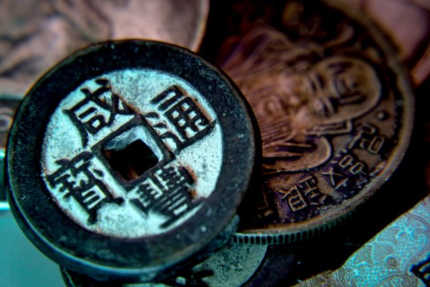
SPARE CHANGE
This final image is of some old Chinese coins. Again, I used an LED studio light to color everything cyan. In editing, I desaturated some of the blues to make some of the orange tones stand out. I increased the texture and lightened the closest coin to make it a stronger focal point.
FIND ME ON SOCIAL MEDIA

kaden’s content
Bannack – Fine Art
By Kaden Stephens
This week, I am posting the fine art pictures I was able to capture during my trip to Bannack Ghost Town. While I was there, I surprised myself with the pictures that I was able to capture. Here are five of the fine art pieces that I thought turned out amazing:
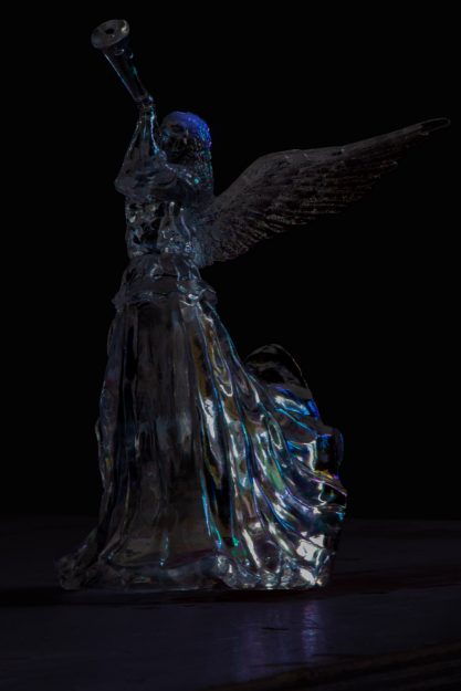
FALLEN ANGEL
I was able to capture this image in a naturally lit room by a window. The subject was a glass angel that reflected the light from the window beautifully. When it came time to edit, I tried something different. I lowered the exposure and altered the subject to have a more blackened appearance. This gave the piece a more sinister tone that I found to be very interesting. I’m super excited with how it turned out.
STILL WATER
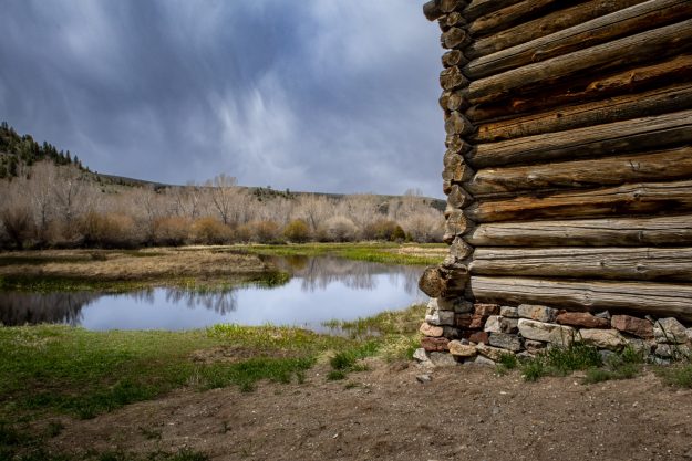
This next photograph was taken of a shallow pond just behind the abandoned buildings of the ghost town. I used bracketing to capture three different exposure levels that I could merge in editing. The still water created an awesome reflection of the trees and sky.
BROKE DOWN
This next image was of an abandoned truck that sat in the middle of an empty field. Again, I captured this image using bracketing to show all the shadows and highlights of the scene. During editing, I was able to enhance the colors and textures of the image. You can see how big of a difference editing made with this picture.
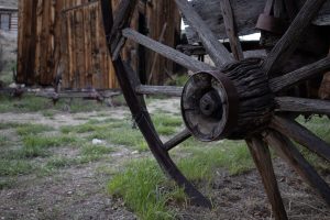
BROKEN WHEEL
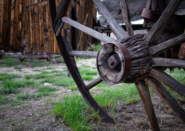
This next image was of a broken wagon wheel. The old wood had amazing textures that I wanted to capture in my photo. Initially, the image came out a little dark, so I edited in a higher exposure to enhance the details.
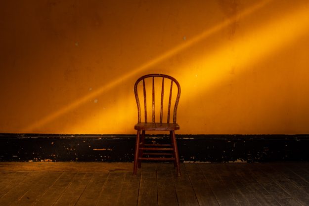
MISSING FRIEND
Initially, this next image appeared very plain and boring, and I wasn’t intending on including it. However, As I went in and began editing it, I was surprised by how beautiful this simple scene could become. In editing, I enhanced the yellow background and added some textures. Afterward, I added in some angled light beams that added more shape to the image. Once it was done, I was surprised by how striking the image turned out.
FIND ME ON SOCIAL MEDIA

kaden’s content
Bannack – Portraits
By Kaden Stephens
This week, I’ll be showing some of the portrait pictures I was able to take during my trip to Bannack Ghost Town. These were really fun to take since we brought in actors to model around the abandoned buildings. For each of these images, I used different lighting methods. This post will show the portraits taken with continuous lighting, speedlights, and natural light. There will also be images taken of groups.
CONTINUOUS LIGHTING
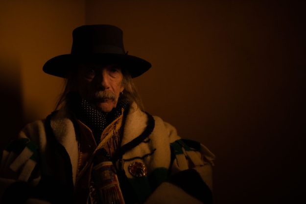
ALONE
WAITING
The above two images were taken with LED light wands and Reflectors. Our model, David, was able to sit in front of these lights giving us some great poses. I shot close-up photos with strong contrasts between the highlights and shadows.
NEW SHOES
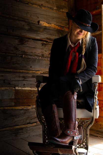
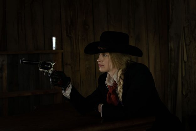
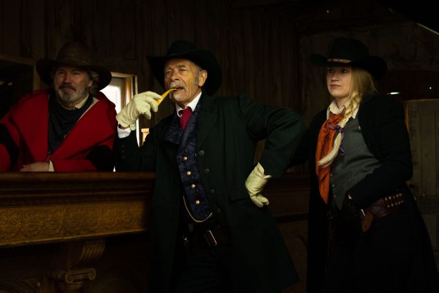
We went into an old saloon for the following few images where we used studio lights and reflectors with our three new models. I was able to get some interesting photos of our models showing off their props.
A SHOT IN THE DARK
OLD PIPE
OLD PIPE (NO REFLECTOR)
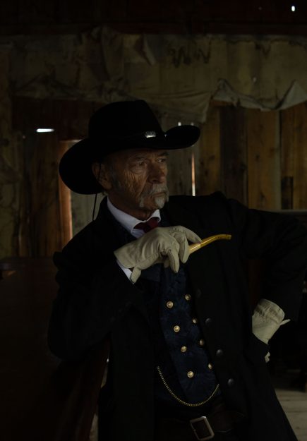
The above two images were taken in the same lighting, but one used a reflector while the other didn’t. You can see the difference between the top image and the bottom image as the reflector was able to brighten the model’s face and bring out more of the colors.
CANDLELIGHT
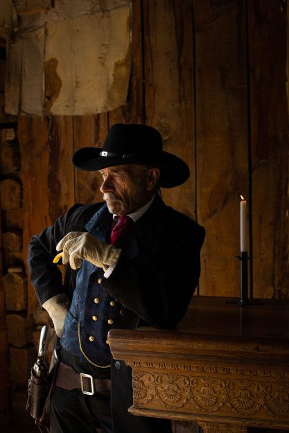
As I worked more with the model, I moved him toward the window to get more natural lighting on his face. We lit a candle and were able to add more to the emotion of the scene.
THE UMBRELLA
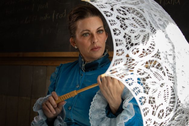
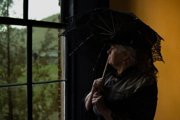
After we were done in the saloon, I moved over to the schoolhouse where I was able to capture a nice picture of our next model staring through her laced umbrella. I wanted to compose the scene by shooting the image passed her open umbrella.
DEFEND
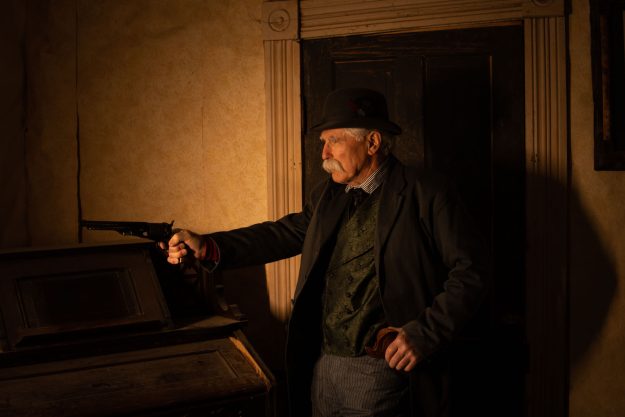
After the schoolhouse, I made my way to an old building where I caught an image of one of our models holding his pistol. This created the scene of him protecting his home from intruders.
SPEEDLIGHT
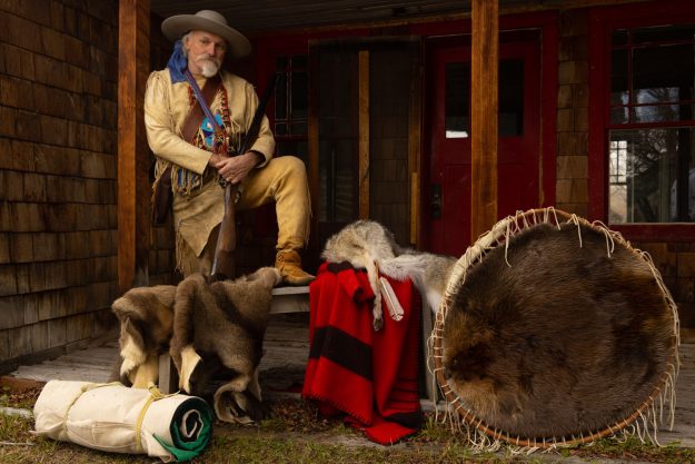
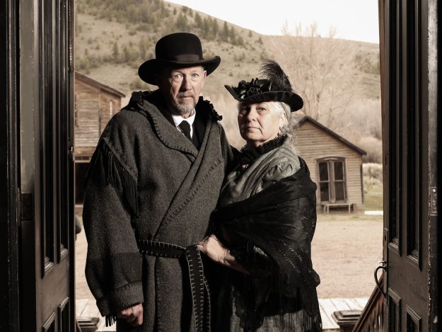
I also worked with speedlights and strobes. In these next images, I used strobes and speedlights to illuminate our models in their different surroundings. In the first image, I captured our mountain man model standing in front of a red door with all of his gear. In the next image, I was able to capture the image of an older couple standing together in a doorframe. Without the use of these lights, the models would not be visible in the harsh lighting.
MOUNTAIN MAN
LASTING LOVE
GROUP
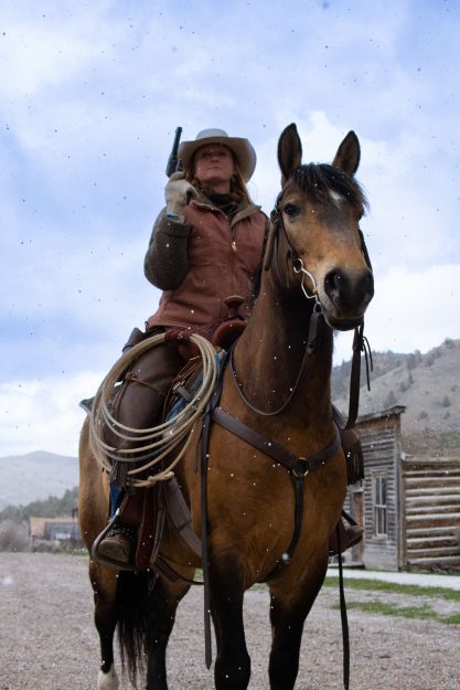
I also worked with groups of models. This first image is in natural lighting where I was able to frame the horserider aiming her gun through the arm of her captive. To get the lighting correct, I used bracketing where I merged three separately-lighted images together. The second image was taken back at the saloon where the three models stood by the bar. For this shot, studio lights were used to keep the dark building illuminated.
HANDS UP
GOSSIP
NATURAL
As I finished up with the auxiliary lights, I wanted to try some pictures with natural light and bracketing.
RALLIED
This first image was taken using a bracketing method. To bracket an image, you capture it at three different exposure levels. Once you go in and edit the photo, you merge all of the images together to get the best highlights and shadows possible. For this composition, I was able to stand beneath the rider as she lifted her pistol to the sky.
PASTURE
EMBARK
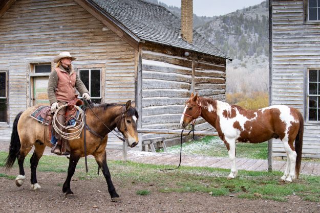
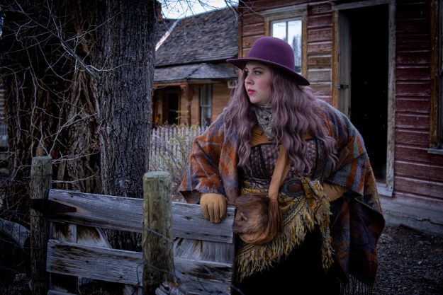
The next images remain outside in the natural light of the cloudy sky. The first follows the rider as she passes by a second horse tied to a railing. I wanted to compose an image where both horses could be visible. The next image is with our other model as she prepares to leave through a gate. I composed the image as though she were ready to embark on a long journey away from home.
THE DRESSMAKER
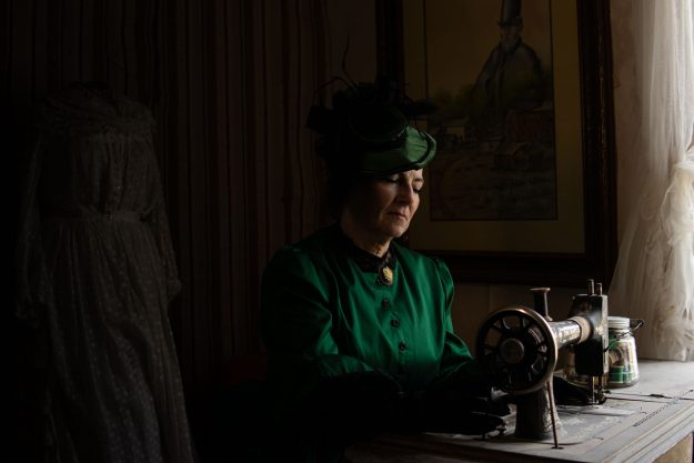
The remaining images were taken indoors but lit through the natural light coming in through the windows. The image of the dressmaker was captured while she was acting with her sewing machine as though she was making her next gown. The next image shows our other model staring through her window into the trees. I had her stand back towards the yellow wall to add more color to the composition.
THROUGH THE WINDOW
FIND ME ON SOCIAL MEDIA

kaden’s content
Bannack – Creative
Rusted Metal
By Kaden Stephens
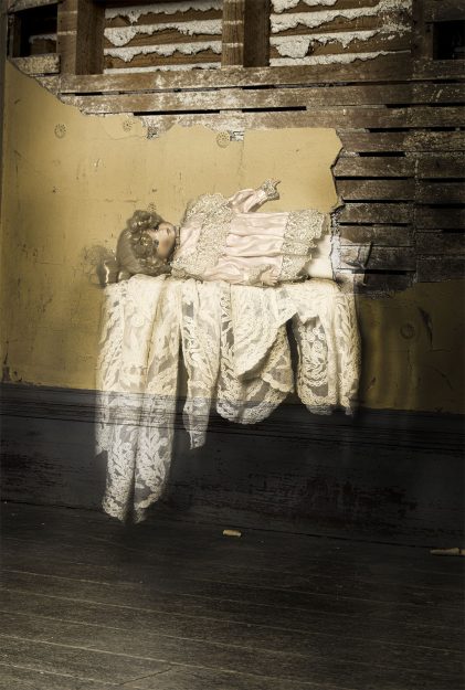
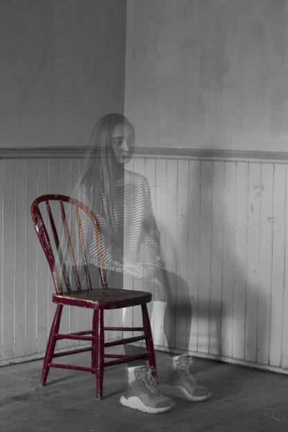
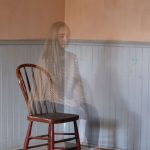
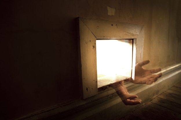
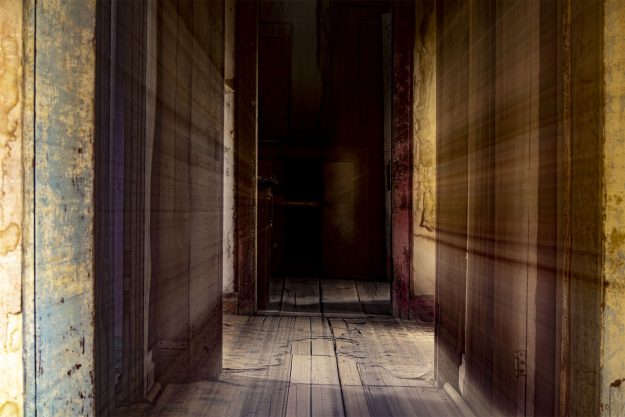
This week, I am posting more of the photos I took during my trip to Bannack Ghost Town in Montana. In this post, I will cover some of the creative images I was able to take of some spooky subjects. These images will show examples of levitation, ghost, conceptual, commercial, and abstract photography.
LEVITATION
GHOST DOLL
GHOST
GIRL IN THE CHAIR
CONCEPTUAL
OUTREACHING HANDS
COMMERCIAL
CONVERSE AD
ABSTRACT
RACING COLORS
FIND ME ON SOCIAL MEDIA

kaden’s content
Colorful Fruits and Berries – Reverse Engineering

For this week’s blog post, we are going to be looking into the design principles Татьяна Павлючик utilizes in her vector illustrations of fruits and berries.
A link to their original artwork can be found at the following link:
analysis

Alignment
Alignment alone can bring focus to a specific element and keep the overall look of a design balanced. This vector illustration maintains a simple design by centering the alignment. The illustrated berries all follow the horizontal line along the center of the page. This makes the design simple and easily understandable. The remaining elements spread from the center and frame the berries as the subject. The alignment of the yellow and cream shapes complements the positioning of the berries. This keeps the berries as the main focus of the design without creating any background distractions.

Contrast
The contrast used in this design quickly directs our eyes to the blueberries. The strongest contrast takes place between the dark blue berries and their surrounding yellow shape. This harsh contrast makes our eyes immediately notice the subject. This design also uses a hierarchy in its contrasts. Since the strongest contrast will capture the viewers’ attention first, it keeps the subject of the design as the main focus of the image. As the remaining elements of the design were added, their contrast was made lower to keep from distracting from the main subject. The contrast from the yellow shape to the cream shape is still strong; however, it is less noticeable than that of the berries. As the cream shape sits in the back of the design, the white background gives it the lowest contrast. This keeps viewers’ eyes from drifting too far away from the center of the design.

Color
The main colors of this design are complementary and improve the appearance of the illustrations. The colors that stand out most in this design are blue and yellow. When viewing a color wheel, these colors would sit opposite each other. This makes them highly complementary to each other and holds a strong contrast. When it came to choosing a background for the blueberries, the color yellow was a great option. This creates an interesting contrast that enhances the blue in the subject. When it came to choosing the third color for the background of the design, an analogous color to the yellow would create a weaker contrast that would keep the attention on the subject. The cream color became a good option as it was a smooth transition between the yellow shape and the white background. It has a low contrast between both colors and naturally directs the eye back to the area with the most contrast.
Conclusion
As you put all of these design principles together, you are left with a simple and effective art piece. The overall design is meant to be simple and easily recognizable. The blueberries were the main subject of the design and were continuously enhanced through the basic design principles of alignment, contrast, and color. Each principle was simple, yet continually drew the eye back to the blueberries sitting at the center of the illustration.
FIND ME ON SOCIAL MEDIA

kaden’s content
Bannack – Series
Rusted Metal
By Kaden Stephens
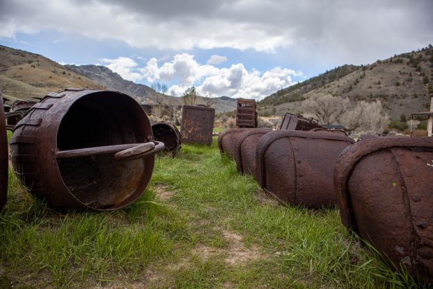
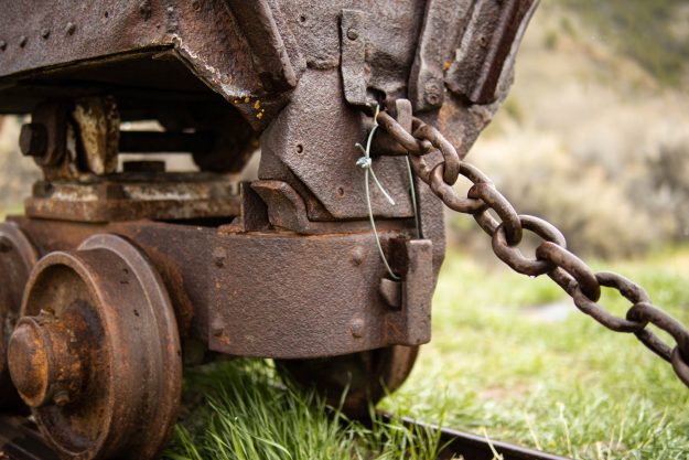
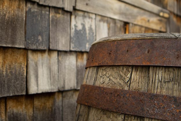
This week, for my photoshoot, I visited the Bannack Ghost Town in Montana. In this post, I will cover some of the series images that I was able to take while I was walking around the spooky abandoned buildings. For my series images, I took pictures of all the rusted metal that I found lying around. There were rusted barrels, mining carts, and plenty of other things that showed the slow decay of the ghost town. Though there was plenty of erosion, there was so much beauty in all the pieces that made up Bannack.
RUSTED PARTS
RUSTED CART
RUSTED BARREL
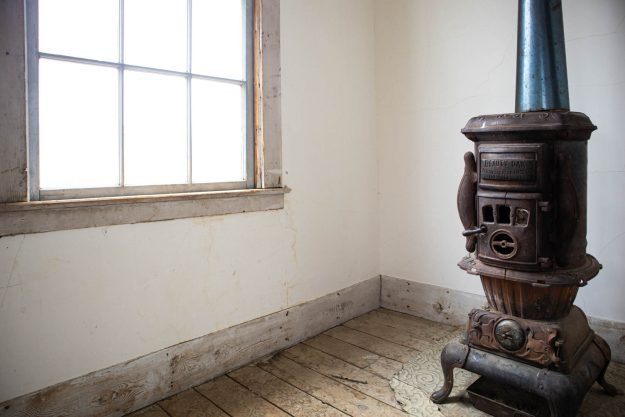
RUSTED FIREPLACE
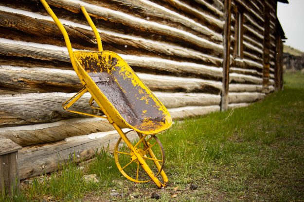
RUSTED WHEELBARROW
FIND ME ON SOCIAL MEDIA

