BLOG
Landscape – Mesa Falls
Perspective of Nine
By Kaden Stephens
This week, I took a short trip with some of my friends out to the Mesa Falls. This was a perfect opportunity to bring my camera and capture some landscape photos. For this particular project, I wanted to capture nine different images of the same subject using different vantage points, depths of field, and focal points.
I also decided to try out a new technique by adding a texture overlay to one of my images. The falls were amazing and made for a perfect subject in the images that I took.

Photo Process
The photo-taking process followed us around the entirety of the falls as my friends and I traveled to different vantage points of the area. At first, we reached the Upper Falls area where there was a wooden platform we could use to see the face of the waterfall. There were plenty of benches and staircases strewn about the platform that added to the scene. I even added a texture overlay to one of my images to create an interesting effect on the old wooden boards of the platform. Each of these angles was able to show a small piece of the falls before ever seeing them in their entirety. After viewing the waterfall up close, we went further down the road where we could see the falls from a distance. From this angle, there was no longer a platform for us to use. We stood over a large ravine where we could see all of the surrounding areas. The view was beautiful. Without the platform, we got to climb more through rocks and trees and experience more of the environment. To humanize the scene, I was able to capture a picture of my friend with his dog sitting on the edge of a huge rock with the waterfalls in the background. The landscape was beautiful and created an amazing scene to capture some fun images.

THE STAIRWAY DOWN


SITTING

THROUGH THE FENCE

WATERFALL

FALLING WATER

THROUGH THE BRANCHES

LOOKING DOWN

PINE NEEDLES

MAN’S BEST FRIEND
FIND ME ON SOCIAL MEDIA
kaden’s content
Depth
Deep & Shallow
By Kaden Stephens
This week, I captured images with both deep and shallow depths of field. This was done through the use of my camera’s aperture. A deep depth of field is caught with a narrow aperture, and a shallow depth of field is caught with a wide aperture.
Deep Depth of Field

STONES: 05/04/22, 1:00 pm, BYU-Idaho Campus, FL: 30mm, f/16, 1/1000 sec, Canon M50 II, Natural Lighting
This first image was caught as I was walking around the BYU-I campus. I noticed a large pile of rocks and thought it would be an interesting shot. As I caught this image with a narrow aperture of f/16, I was able to keep every detail of the rocks in focus.

AN EVENING WALK: 05/08/22, 8:45 pm, South Branch Rexburg Canal, FL: 30mm, f/16, 1/60 sec, Canon M50 II, Natural Lighting
The other evening, my friends and I went for a walk around Rexburg. As it started getting late, the sky began turning a beautiful shade of blue. I was lucky to have my camera on hand to take a few pictures. This image was caught with a narrow aperture of f/16.

TREES IN THE SAND: 04/30/22, 1:00 pm, St. Anthony Sand Dunes, FL: 15mm, f/22, 1/15 sec, Canon M50 II, Natural Lighting
Along with the pictures of motion I shared in my previous post, I was also able to capture another image that demonstrates a deep depth of field. This is a picture I caught while at the St. Anthony Sand Dunes. I found a small cluster of trees at the edge of a large dune. This gave it an amazing view of the sand dunes in the distance. I was able to capture this image with a narrow aperture to keep each detail sharp in the background.
Shallow Depth of Field

BRICK WALLS: 05/08/22, 8:50 pm, The Towers, FL: 15mm, f/3.5, 1/160 sec, Canon M50 II, Natural Lighting
I was happy with how this image turned out. The same night that I was walking with my friends, I spotted a brick building that I thought would be fun to take a picture of. I was able to position my camera where I caught several different angles of light reaching the walls. With a wide aperture, I was able to slightly blur the out-of-focus bricks that filled the background.

FLOWERS: 05/04/22, 1:00 pm, BYU-Idaho Campus, FL: 30 mm, f/2, 1/1250 sec, Canon M50 II, Natural Lighting
To capture this picture, I found a patch of flowers on the BYU-Idaho campus. I had to get up close to them to get an angle that I thought would best show off the subjects. I used a wide aperture of f/2 to get a lot of bokeh in the background. By doing this, I could keep the focus on the flowers rather than what was going on in the background. I was happy with how it all turned out.

RAILROAD TIES: 05/02/22, 12:30 pm, US-20 Railroad, FL: 30mm, f/3.5, 1/1000 sec, Canon M50 II, Natural Lighting
This photo ended up being one of my favorites. On a drive from Rexburg to Ammon, my friends and I noticed a railroad bridge that was sitting close by the highway we were driving on. I was able to climb onto the tracks and capture a cool picture of the crossties. I thought it created an interesting effect as I lowered the aperture to f/3.5. This created a large amount of bokeh in the background that directed the focus to the railroad ties.
FIND ME ON SOCIAL MEDIA
kaden’s content
Icon Set – Reverse Engineering
For this week’s blog post, we are going to be looking into the design principles Dallee Nam utilizes in their Finance Glass Icon Set.
A link to their original artwork can be found at the following link:
https://www.behance.net/gallery/117862883/Finance-Glass-ICon-Set/modules/671541343
analysis
Contrast
This Icon set uses contrast to create a glass-type effect between the various pieces. The transparent portion has a harsh contrast to the dark background. This creates the glass-like appearance of the icon. The outside stroke of each element is a lighter color compared to the fill. This creates a stronger contrast to its darker surroundings while also making the edges more prominent. This slight effect also adds to making the various elements of the icon set more noticeable. If the icon set were to be placed on a lighter background, the design would not have the same effect.
Hierarchy
In each of the icons, there is a hierarchy between the solid color and transparent portions. This hierarchy is what makes the transparent portion appear transparent. Nam is able to accomplish this by having there be a slight overlap with both parts, the transparent portion on top and the solid color portion on the bottom. This slight overlap makes the pieces look stacked on top of each other. This adds to the desired effect and guides the attention of the viewer. To make the design more noticeable, Nam included a slight gaussian blur to the area that is covered by the transparent piece. Together it adds depth to the design, making it appear more complex while maintaining a minimalistic style.
Repetition
A key part of a successful icon set is repetition. In order for an icon set to be cohesive, the elements of each icon must relate to those in the entire set. Without this, the icons would not work together to convey a single message. Through the use of repetition, this icon set is both cohesive and understandable. Within this set, Nam uses color, size and effects equally for the design of each icon. Each icon is scaled to the same proportions as the other. Through this, each icon takes up the same amount of space. This icon set also uses a consistent color scheme. A final consistency is the inclusion of the solid-color and transparent portions within each icon. This great use of repetition is what makes this particular icon set stand out. The matching color gradients and styles make each varying icon more interesting to look at.
Conclusion
The key part of a design is to take a goal and give it a function. This is the purpose behind icons. They communicate a simple message that is easy to understand outside the boundaries of language. Nam was able to accomplish this in their icon set. Each icon, though complex in its design technique, conveys a very straightforward message. Nam, through the use of contrast, hierarchy and repetition, was able to create a stunning icon set that is both quick to communicate and impress.
FIND ME ON SOCIAL MEDIA
kaden’s content
Light – Motion
Freeze & Blur
By Kaden Stephens
This week, I went out and captured some photos of motion. Each photo shows my personal interpretation of motion and how we can view the world around us through a single image. For each of these photos, I had to learn the right balance between my camera’s light settings and the shutter speed I needed to catch specific movements. With a faster shutter speed, I was able to freeze motion. With a slower shutter speed, the motion in my images became blurred.
Frozen Motion

VIBIN’ HAIR FLIP: 04/30/22, 1:00 pm, St. Anthony Sand Dunes, FL: 30mm, f/2.8, 1/1000 sec, Canon M50 II, Natural Lighting
A few of my friends and I went out to visit the St. Anthony Sand Dunes over the weekend. This particular photo is of my friend flipping her hair as the wind started to pick up. With a quick shutter speed, I was able to catch her hair being lifted in the wind.

BALL TOSS: 04/30/22, 12:45 pm, St. Anthony Sand Dunes, FL: 30mm, f/2.2, 1/1000 sec, Canon M50 II, Natural Lighting
As my friends and I continued walking around the sand dunes, one of us spotted an old tennis ball. My friend picked it up and began tossing it up and down. I managed to capture an image with the ball frozen in the air.

FALLING SAND: 04/30/22, 12:30 pm, St. Anthony Sand Dunes, FL: 35mm, f/5.0, 1/2000 sec, Canon M50 II, Natural Lighting
I decided to test out taking a close-up image of my other friend cupping the sand in his hands. This photo was able to capture the sand slowly sifting through his fingers.
Blurred Motion

A NIGHT AT THE GARDENS: 05/01/22, 9:00 pm, Thomas E. Ricks Gardens, FL: 38mm, f/5.6, 30 sec, Canon M50 II, Natural Lighting, Set camera on a rock
To catch blurred motion, I wanted to attempt taking photos while it was dark outside. This would allow me to slow the shutter speed as much as I needed in order to blur as much motion as possible. For this photo, I walked around the BYU-Idaho campus gardens after dark. To capture the image, I set my camera on a rock and left the shutter open for 30 seconds. This let in as much light as possible to reveal the moving water. Even though the setting was dark to the natural eye, the slow shutter speed was able to capture the image beautifully.

LOST: 04/30/22, 12:40 pm, St. Anthony Sand Dunes, FL: 15mm, f/22, 1/6 sec, Canon M50 II, Natural Lighting
Blurring motion during the day was a little more tricky. Blurred motion requires a slow shutter speed, but that leaves time for more light to enter your camera. To keep the light from flooding the camera as I took this photo, I raised the aperture and lowered the ISO. This particular image shows a purposeful blur of my friend’s face with a clearer focus on the empty background. I felt that this effect created a sense of disconnection between him and his surroundings, similar to the feeling of being lost.

FLOWING WATER: 05/01/22, 9:30 pm, Taylor Chapel, FL: 21mm, f/5.0, 8 sec, Canon M50 II, Campus Lights, Set camera on a rock
In addition to the other two frozen motion images that I caught, I wanted to capture a photo with an illuminated subject in the background. For this photo, I went in front of the Taylor Chapel where there are a few water features. This setting was different from the gardens as there was more synthetic light around both the foreground and the subject. To capture this photo, I climbed into the rocks and balanced my camera at an angle that I liked. With an 8-second shutter speed, I was able to capture both the blurred water and the illuminated subject.
FIND ME ON SOCIAL MEDIA
kaden’s content
Retrato de una mujer – Reverse Engineering

Let’s look into a few of the basic design principles that Halyna Shuliar utilized in her vector art piece: Retrato de una mujer (Portrait of A Woman). Shuliar is a photographer and web designer out of Madrid, Spain who has several of her pieces linked in her Behance profile.
A link to her original artwork can be found at the following link: https://www.behance.net/gallery/141728935/Retrato-de-una-mujer/modules/800718783
analysis

Value
When looking at a design, the value refers to the gradation of light to dark across a form. It pertains to how light or dark an element of a design may appear. A noticeable feature of this piece is the slight transition from light to dark along the horizontal of the subject. The shadow that is cast on the right side of the image adds more variety to the image and makes it feel more life-like. It creates depth and adds to the realism of the design. It also adds to the duality of the piece as there is both a light and a dark side that can be connected to a variety of emotional interpretations. The value created in this piece both reveals the form of the woman and blends her into the darker colors of the background. This adds an emphasis to the midline of the artwork, where the brightest colors are used. The amazing variations of color values used within this graphic add to its depth and emotional interpretation.

Contrast
In design, contrast depicts the differences between two or more elements of the artwork. When used well, the contrast can determine the first thing that the viewer is going to look at. When it comes to this piece, there is a strong contrast between the subject and the background. The woman in this graphic is illustrated lightly with the use of brighter colors. The background, however, is dark with just a flat layer of black. This creates a strong focus on the woman. This strong contrast keeps viewers from looking into the wrong area of the artwork. An additional area of contrast would be the color of the lips. While a majority of the colors used in the piece share the same hues, the lips are colored in a vibrant red. This contrast pulls the viewers’ gaze deeper into the dark half of the piece.

Hierarchy
The hierarchy of a piece determines which elements of the design will be most visible. As stated before there is a strong variation in brightness across the horizontal of the above piece. This adds to the hierarchy of the design. The left half becomes more of a focal point as the brighter colors bring more detail to the subject. The hierarchy of a design is similar to contrast in the way that it can determine the order of what an audience will look at. When viewing this piece, naturally an audience is going to look at the left half first, mostly towards the eye. This is due to the presence of the brightest colors and strong details. The right portion of the graphics will be viewed last as the details become less defined and blend into the background. The hierarchy of this design helps arrange the art piece in a way that is easily followed and understood by its viewers.

repetition
Repetition involves using the same element of a design multiple times throughout the artwork. Shuliar accomplished this by including the flower elements repeatedly throughout the piece. The flowers illustrated on the face are also present within the fabric of the clothing. This creates a balance within the subject and adds to the beauty of the design. This great use of repetition also helps add texture to the design. It emphasizes the beauty of the woman while framing the focus around her.
Conclusion
Overall, the design techniques used within Shuliar’s graphic art piece, Retrato de una mujer, make it appear both realistic and beautiful. When looking at this design, you can’t help but look closer. Each detail is so precise and fits perfectly with the overall design. I find this artwork to be a beautiful representation of talent and an inspiration to other designers on how to construct a masterpiece.
FIND ME ON SOCIAL MEDIA
kaden’s content
Introduction to Exposure
A Study of Aperture, Shutter Speed and ISO
By Kaden Stephens
The most important element of photography is lighting. Without it, images would not be possible. The way that light is used can depict the story an image will tell. When it comes to photography, the amount of light we use is referred to as exposure. The greater the exposure, the more light we are letting into an image. Exposure requires a balance of light. Too much light will create overexposed highlights and a faded image. Too little light will create underexposed images that are too dark to see. Through the study of aperture, shutter speed and ISO, you can learn to balance the light and produce strong contrasts and vibrant colors within your photography. To look into these lighting methods, I have collected a few example images from pexels.com.
Aperture
Aperture refers to the opening within the lens that controls the amount of light going into the camera. Its function is similar to that of a pupil, which dilates according to the brightness of its surroundings. Aperture, similarly, will control the size of the opening within your camera’s lens and adjust your lighting and depth of field according to the subject of your image. A camera’s aperture is measured in units of f-stops or f numbers. The lower your f-stop, the wider your aperture will be, and vice versa.

Wide Aperture
The above image is an example of a wide aperture. This means the lens is more open and is allowing more light into the camera. A photographer would want to use a wider aperture to create a shallow depth of field. This would put a greater focus on the single subject of an image while blurring the background. This can be seen in the example above. The subject of the image (the camera) appears clear while the background is blurred. This keeps the focus on the subject rather than the entirety of the image. This wider aperture would be accompanied by a smaller f-stop, like f/2.

Narrow Aperture
This next example demonstrates a narrow aperture. This means the opening in the lens is more narrow and is constricting the amount of light making its way into the camera. This method produces a deeper depth of field that creates an even amount of detail throughout the image. This eliminates the background blur that would be present in a wide aperture image. A photographer would want to use a narrower aperture to produce an even focus throughout the image with consistent details. Looking at the example above, you can see that everything from the close-up trees to the distant mountains is in focus and well defined. A narrower aperture would be accompanied by a larger f-stop, like f/16.
Shutter Speed
Shutter speed refers to the amount of time the shutter of your camera is open. Depending on the speed of your camera’s shutter, an image can look frozen in time or show blurs of motion. Shutter speed also accounts for the amount of time you are giving light to enter your camera’s sensor and increase the exposure of your image. Shutter speed is measured by seconds or fractions of seconds. This depicts the amount of time your camera’s shutter curtain is open, exposing your sensor to light.

Fast Shutter Speed
The example above shows an image taken with a fast shutter speed. Notice how each of the water droplets appears frozen in time. There is no motion blur from the moving water. This is because the shutter curtain of the camera was open just long enough to capture the image without getting any blur from the movement of the water. A fast shutter speed would be around 1/500 of a second and is a great way to capture a frozen image.

Slow Shutter Speed
This next example shows an image taken with a slow shutter speed. Notice the difference from the previous example where the water droplets are no longer frozen in time but blend together to show the motion of the water. This is due to the camera’s shutter being open long enough to capture the motion of each water droplet. This helps bring life and movement into an image. This method also helps when taking pictures in darker areas. When the shutter speed is slower, it allows more light to reach the sensor and brightens a darker image. The example above was taken in darker lighting, but with the slower shutter, more light and contrasts were able to be visible in the image.
ISO
Another technique that I find interesting when it comes to exposure is a camera’s ISO. The ISO represents the sensitivity of a light sensor within your camera. A low ISO would have lower light sensitivity and a higher ISO would have greater light sensitivity. There is a delicate balance between your ISO, aperture and shutter speed. More is not always better. Having the ISO set too high will fill an image with digital noise, making it look grainy. Too low of ISO will leave an image underexposed.

High ISO
The example above shows an image taken with a high ISO. An interesting thing about ISO is that it is very helpful when shooting night photography. By raising the ISO, you can brighten a darker setting and bring out more vibrant colors. As stated before, there is a delicate balance that needs to be maintained to keep an image from looking too grainy. When shooting night photography, it is best to use a high ISO with a wide aperture and a slow shutter speed. This will allow the maximum amount of light to be captured in the image. The camera also needs to be held still. This can best be accomplished through the use of a tripod.
FIND ME ON SOCIAL MEDIA
kaden’s content
Welcome
")
HELLO,
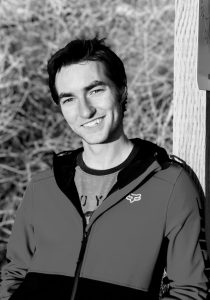
Welcome to Kaden’s Content!
I am so excited to continue building up a collection of all my content. I’m a visual designer who keeps messing around with new things and building up different hobbies. I hope you guys will enjoy all the random things I find myself doing. I hope that my work can spark a little bit of creativity in each of you or possibly inspire you to try out something new.
FIND ME ON SOCIAL MEDIA
kaden’s content